Welcome to the e-Book Cover Design Awards. This edition is for submissions during October, 2015.
This month we received:
111 covers in the Fiction category
19 covers in the Nonfiction category
Comments, Award Winners, and Gold Stars
I’ve added comments (JF: ) to many of the entries, but not all. Remember that the aim of these posts is educational, and by submitting you are inviting comments, commendations, and constructive criticism.
Thanks to everyone who participated. I hope you enjoy these as much as I did. Please leave a comment to let me know which are your favorites or, if you disagree, let me know why.
Although there is only winner in each category, other covers that were considered for the award or which stood out in some exemplary way, are indicated with a gold star: ★
Award winners and Gold-Starred covers also win the right to display our badges on their websites, so don’t forget to get your badge to get a little more attention for the work you’ve put into your book.
Also please note that we are now linking winning covers to their sales page on Amazon or Smashwords.
Now, without any further ado, here are the winners of this month’s e-Book Cover Design Awards.
e-Book Cover Design Award Winner for October 2015 in Fiction
Suzy Vitello submitted The Keepsake designed by Kit Foster. “The Keepsake is the second in my Empress Chronicles series. The first was traditionally published and this one I put out myself. Same cover designer!”


JF: Exquisite, subtle, and very affecting. There’s a great dynamic between the classical composition and the asymmetric woman’s face that creates a powerful pull into the story.
e-Book Cover Design Award Winner for October 2015 in Nonfiction
Elizabeth DiPalma submitted Closest to the Fire designed by Elizabeth DiPalma. “This book is for writers looking to make their books more accurate with regard to law and courtrooms, but it’s neither dry nor stuffy. The author has a great sense of humor, which I tried to convey via the cover art. The engraving also neatly sidesteps the issue of gender.”

JF: Absolutely delightful, and the engraving with red typographic accents is perfect for this material.
Fiction Covers
A N King submitted Jungle Paradise designed by A N King.

JF: Not a bad job although the type is pretty basic and not adding much to the design.
A. E. Oglesby submitted Juniper Ash designed by A. E. Oglesby.

JF: Clever and attention-getting.
Alicia Rades submitted In Jacob’s Arms designed by Clarissa Yeo. “My first thought on this cover was that I really liked how it represented my characters (they look how they’re described in the book), but I also love the text Clarissa chose and how the J and B seem to create a sort of balance. I’m not the design expert, though, so I look forward to your thoughts!”

JF: Beautiful and, yes, balanced, although the couple has been ghosted almost too much to be easily seen.
Alira A. Rosi submitted Bohemian Lessons designed by Alira A. Rosi and the book lady. “After studying the main commonalities among popular poetry book covers–simple, but visually interesting with a smaller, sharp font–I developed this cover concept using a photo I took of my favorite bust sculpture lit by candle light. Cover designer, the book lady, tightened up the design concept.”

JF: Very nicely done, and the diagonal from the title through the image to the author’s name keeps it interesting. I like the care with which the type was used for this poetry book.
Amanda DeWees submitted Upon a Ghostly Yule designed by James T. Egan of Bookfly Design. “I gave James the challenge of creating a cover that was visually in the same universe as my other Victorian romantic suspense novels but also incorporated a Christmas theme–and at the same time it had to suggest a ghost story! The result is this wonderfully evocative cover.”
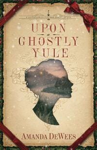
JF: Brings together the designer’s deft hand with detail, controlled palette, and sensitive typography. In this case I wonder whether the title could have used more emphasis.
Amie Irene Winters submitted Strange Luck designed by Humbert Glaffo. “Thank you.”

JF: Flying goddesses, how can you not like that? Simple and straightforward.
Ana Franco submitted Down the Wormhole designed by Alexa_Fotos.

JF: Ineffective, odd.
Angela Oltmann submitted What Lainey Sees designed by Angie-O e-Covers.
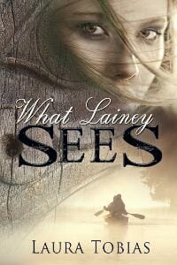
JF: Lots of story on this solid cover, and a design that ties into the title perfectly.
Angelina Kalahari submitted The Healing Touch designed by Indie-Go. “The image for my e-book’s cover was photographed by a fashion photographer. The intertwined hands symbolizes the relationship between the lovers in this complex and compelling story. The fact that the nail varnish isn’t perfect comments on the protagonist’s state of mind.”

JF: Although it’s a lovely photo, it could use more contrast and drama, and the title isn’t holding up to the photo very well.
Ariana Hawkes submitted Once Bitten Twice Smitten designed by Angie Teo.

JF: Having a whole crowd on the cover dilutes the effect of showing the characters at all, not usually a good outcome.
Ayodeji Erubu submitted Cynthia’s Diary; the first quarter designed by Partridge Publishing Design layout department. “Cover design depicts the story of a young lady battling with the psychosocial bondage of Substance Abuse.”
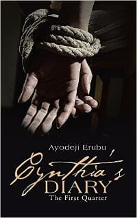
JF: With only the one strong visual, the cover is completely focused on delivering its somber message.
Baylie Karperien submitted Unsettled designed by Baylie Karperien. “The central design, a Phoenix surrounded by flames, represents the protagonist. The night sky draws in other themes of the book, summarized in this quote: “Sometimes, the sky has to darken so the stars can shine brightest. Because there is nothing left to hold on to, and fear grows wings to fly.””

JF: Problem is no casual browser knows any of the that background, so it’s kind of irrelevant. I like the clean look of this design, but the title has been so overworked its competing with the image for attention.
Bo Burnette submitted Finding Viola: A Short Story designed by Ronnell D. Porter. “Ronnell isn’t fast about communication, but if you stick with him, he produces quality work for an affordable price.”

JF: Stylish typography, and that door is pregnant with possibities. It works.
Brandt Trebor submitted The Road To Grandeur designed by Lindsey Wakefield. “Lindsey created this amazing book cover for me. So many fantasy novels have some generic scene with a sword carrying hero on a horse looking into the horizon. I wanted something less cliche and a little more edgy but still conveying YA fantasy.”

JF: Always good to try something new, but the type here is inappropriate to this genre and could use a more emphatic layout.
Bridget McKenna submitted Evenings, Mornings, Afternoons designed by Bridget McKenna for Zone 1 Design. “This cover for a collection of science fiction and fantasy stories uses elements from the e-book covers of a few of the individual stories.”

JF: Charming and surreal all at the same time.
C.B. Cook submitted Paralyzed Dreams designed by C.B. Cook.

JF: The stark photo is affection, the rest of the cover doesn’t measure up, and the curlicue ornaments seem wildly out of place.
C.N. Crawford submitted A Witch’s Feast designed by Carlos Quevedo. “This is the second book in the Memento Mori Series. For this cover we asked Carlos to incorporate some of the YA cover trends, like a girl in a ballgown, while still emphasizing the gothic tone of the book.”

JF: Beautifully done, with real appeal.
Caitlin Farley submitted Finding the Phoenix designed by Caitlin Farley. “This is an Urban Fantasy. I taught myself GIMP and did a lot of research into book cover design before I created this. While I’m mainly happy with the results, I’m eager to hear your opinion. Thanks.”

JF: Very disjointed elements with no seeming relation to each other.
Chase Chandler submitted Lunacy designed by Chase Chandler. “My first book design. A 1930’s riches-to-rags story based in the deep south.”

JF: Nice job, but don’t try to do too much. Considering all the visual elements you’re asking people to take in, fussing up the title type just adds more for us to process.
Chase Chandler submitted Unwed designed by Chase Chandler. “My 2nd book design, and 2nd book in the series.”

Chase Chandler submitted When the Tide Ebbs designed by Chase Chandler. “My 3rd attempt at a book cover. Thanks for the feedback.”

JF: Some nice elements, but the arrangement seems rather arbitrary.
Chris Syme submitted Cadha’s Rogue designed by Killion Group. “The Killion Group has done all the covers for this series and this one is by far the most popular with our fans.”

JF: With a hero who’s both buff and introspective? No wonder.
Christopher Ruz submitted Rust designed by Christopher Ruz. “This cover is part of a complete rebranding of my horror novels. The old, illustrated covers made readers think they were buying a comic, and I learned pretty quickly that it doesn’t matter how beautiful cover art is if it doesn’t communicate content as well as theme.”

JF: Great job, Christopher. I like the nuance you’ve introduced by using the figure to reveal another landscape, and the controlled tone of the cover allows the main figure to grab us.
Connie Lacy submitted VisionSight designed by James at Go On Write. “This is a fantasy/magical realism novel about a woman who sees the future when she looks into her loved ones’ eyes.”
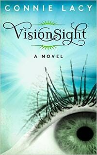
JF: That’s some gorgeous typography, but I have to confess that big closeups of eyeballs creep me out.
Dale Furse submitted Curse (Book 1 of the Wexkia trilogy) designed by Elona Bezooshko. “The cover is the first of a trilogy in Teen and Young Adult, Science Fiction and Fantasy genres. All four of the series’ covers are perfectly suited to the main character’s journey. The fourth cover will be used for a prequel to the trilogy. They just look stunning together.”

JF: Solid genre cover.
Dana Weber submitted The Tallest Timbers designed by Dana Thomas Weber. “Lacey Williams trades her unfulfilling and hectic city life for a rustic cabin in upstate New York. The mountains and rivers provide solace, strife and new beginnings. A gentle paranormal presence is seemingly symbolized as a cardinal at one point. Can you spot this same presence on the cover?”

JF: I can see a face in the ground, but to be honest I wasn’t inspired to look because the drawing is so dull and the title very weak.
Daniel Roberts submitted Darya Rising designed by Daniel A. Roberts. “There should be no doubt in the minds of everyone that this Sci-Fi adventure has a strong female lead. The dark aspect of the cover is also equal to the contents of the novel, and is one of my greatest accomplishments when deciding on this type of design.”

JF: Doesn’t work for me. The two pieces of art look like they belong on different books, and the title is giving me a headache.
Daniel Swenson submitted The Farthest City designed by Thomas Mihm.

JF: Intriguing piece of artwork, could use a less overworked and more adept type treatment.
Daryl Hajek submitted The Preternatural designed by Al Pranke. “The yellowish-green glow behind the book’s title and the faint mist in the background represent the paranormal subject matter in the story. The cloaked, faceless figure in the foreground is one of the characters in the book.”

JF: Not sure about the font choice for the title, I’d like to see something more decorative for this genre, but overall the cover creates a great sense of foreboding.
DJ Larkin submitted The Cupcake Chronicles designed by creativemouse. “The Cupcake Chronicles cover was designed with feminine colors in mind to reach the light, funny tone that the book is all about.”

JF: Love the whole thing, the pink and the lovely artwork, but I do wish the title stood out more.
Effrosyni Moschoudi submitted The Necklace of Goddess Athena designed by 187designz.
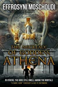
JF: Monumental; exciting.
Ellen Bard submitted Blaize and the Maven designed by Erin Dameron-Hill.

JF: The market for YA fantasy continues to go strong. Here’s a really cover cover for that genre. The designer highlights the heroine’s flaming hand, and the classical type complements the classic elements in the landscape. The twisting body lets us know we’re in for action.
Emily Cyr submitted Push and Pull designed by Najla Qamber Designs.

JF: Clever. Genre and story in one delicious bite.
Emmanuel Arriaga submitted Foundra: The Rift War designed by Dane Low. “When working with Dane, I wanted the cover to convey both the fantasy and science fiction aspects of my book. Because it’s a mix of spaceships with swordplay and magic, I thought it was important to really show that in the cover.”

JF: Swordplay on spaceships? I can see the designer’s challenge, and although the art and type have been well done, as a cover it borders on incomprehension.
Erin Rhew submitted The Prophecy designed by Anita B. Carroll.

JF: A lot of care went into this design, but I wonder if it isn’t too quiet compared to its peers.
Fernando Torres submitted A Habit of
Resistance designed by Fernando Torres. “Defiantly posed on the famous medieval bridge in Brassac, France the nuns are shown after they have joined the French Resistance.”

JF: You’ve definitely produced an arresting image, but it deserves a better type treatment.
F. P. submitted [book title] designed by F.P. “Self designed cover using Powerpoint and image found on-line. So far I have been unable to find the owner of the copyright to the image.”
JF: I removed this cover, which showed a recognizable image of a young girl, and redacted the comment to make this point to all readers: If you don’t have the rights to an image—particularly one that has recognizable people in it—please don’t use it on your cover. First, the image is copyrighted by whoever took it, and the fact that you are “unable” to find the owner does not give you any right to reproduce it. And second, people have a right to privacy that can only be waived by their express consent. Be wary of images you find on sites like Flickr.com where the photographer may have posted them with permission to use, but never bothered to get releases from the identifiable people in the picture. Message: just don’t do it.
G. Elizabeth Kretchmer submitted Women on the Brink designed by Maria Aiello. “Please note the original art, a combination of oil and acrylic, was created specifically for this book by Lindsey Surin.”

JF: What’s odd about it is that the upper part of the woman’s body appears to be running, but the lower part looks like it’s standing still.
Gordon Clemmons submitted Ismira designed by Gordon Clemmons. “The story centers around a teenage trans girl, and I wanted to convey the sense of release and freedom from her accepting and becoming her true self.”

JF: Interesting approach, but I don’t think the graphic design expresses as much as you had hoped.
Graeme Smith submitted Shadow Child designed by Michelle Lee. “Michelle was able to take a cover concept and turn it into something directly linked to the book content. For reasons I cannot explain (but am perfectly happy with (blush)),roughly 70% of my readership is female. When I was test marketing the cover with female victims^H^H^H^H^H^M^H, er ‘volounteers’ :-), the most common positive reaction I got was that the girl on the cover was hot, but managed it without having to rely on skin display, ‘accidental’ or otherwise. Also, Michelle was able to put the Main’s signature Glock 357 in her hand, and turn it pink :-))).”

JF: Hey, a pink Glock is a good magnet, but the rest of the cover, particularly the type treatments, is way overblown. Less is more.
Hailey Woerner submitted Jaded: The SilentWhisperer designed by Hailey Woerner.

JF: Good idea with some nice colors, but when it comes to laying on more and more type effects, less is more.
Hanna Peach submitted Girl Wife Prisoner designed by Romac Designs. “Romac Designs beautifully and simply wove the novel’s symbolism into this cover by choosing an oragami butterfly caught in thorns. This novel is a dark love story where the main character, a young Japanese mail-order bride, begins an affair with her new husband’s gardener.”

JF: Very effective artwork, and that butterfly implies a lot about the story. This cover seem more effective to me because in the one below, the blue type is too dark, rendering it almost invisible against the black background. Other than that, a good and interesting series design.
Hanna Peach submitted Utterly Irreversibly: A Girl Wife Prisoner Novella designed by Romac Designs. “This is the companion novella to Girl Wife Prisoner and told from the gardener’s perspective. Romac Designs kept a similar design and wove more symbolism into the cover by representing the gardener as a bird flying away. It also relates to the 1,000 origami cranes legand which is used in the novel.”

Holly Ice submitted The Russian Sleep Experiment Horror Novella designed by Marek Lewandowski.

JF: Creepy and violent (that’s the “hook”) with some clever type play to allude to cyrillic alphabets.
J.L. Pattison submitted The Visitor designed by Angie Alaya. “The design is intended to capture the mystery feel of the time traveler appearing in a farmer’s cornfield (how the story opens).”

JF: Nicely done. Despite just being a field and sky, the whole landscape is so active it feels alive.
J.Q. Davis submitted Escaping Grace designed by Indie Designz. “My designer and I chose this particular design because it symbolizes a pivotal scene within the story. We felt that it would intrigue a potential reader, and cause them to wonder what exactly is behind the freezer door.”

JF: It’s not too big a mystery, give the arms protruding from behind the door, but yes, it works really well, although I’m not a big fan of the title type that almost looks like it’s pixilating.
Jackie Castle submitted The Sentinel Archives #1 – Through the Portal designed by Jackie Castle. “This story is aimed for middle grade fantasy readers. I’ve been working on learning how to create covers and appreciate any critiques you can give me that will help me to improve. Thanks so much.”

JF: The design is less compelling than it should be because all the information for the browser is in the confrontation the two characters are having with whatever is in front of them, but this element has been made so small it lacks impact. Compare to the amount of space given to fanciful corner elements that don’t really contribute anything.
James Egan submitted All That Glitters designed by James T. Egan of Bookfly Design.

JF: Great contrast between the solid, squared-up type block of title and author, and the energetic cityscape below. Carefully controlled colors help to heighten the effect.
James Egan submitted Shade City designed by James T. Egan of Bookfly Design.

JF: An almost perfect cover for this gritty urban fantasy that highlights the series protagonist amid textures and signs that lead to the story, along with a title the meshes beautifully with the rest of the design. ★
Jamie Buchanan submitted Dirty Deeds designed by Jamie Buchanan. “Dirty Deeds is a comical adventure that features an enchanting but derelict castle in the wilds of Scotland, a beautiful Irish lass and an ex-pat from Georgia whose link to his homeland is his 1968 Mustang.”

JF: Nice idea, but it looks like better skills would be required to combine these images to best effect.
Jeffrey Jones submitted Baby Zero designed by Jeffrey Jones. “Baby Zero is about a family spread across cultures with contrasting lifestyles and freedoms. The story also combines humor and tragedy. The cover art seeks to show these contrasts that meet in the main characters’ lives.”

JF: It works, and the combination of images from different cultures is well done.
Jimmie Hammel submitted Fate Lock: Princess Possessed designed by Jimmie L Hammel. “This book is the third in a series. Each book in the series has the same out layer, but the framed image and title bar color scheme change for each volume.”

JF: I like the image, but this cover, crowded with floral motifs, filagree, and flourishes, is almost collapsing from the weight of it all. A simpler approach would highlight the visual—the “money” part of the cover—much better.
joanne Macgregor submitted Scarred designed by Renee Naude.

Karen Bryson submitted Silent Cats: Deadly Dance designed by Tony Bryson. “This is a romantic suspense thriller. We wanted to capture elements of both suspense and romance in the cover design.”

JF: Interesting composition, and if the very busy background was toned down on the top third of the cover, the elongated title type would be more emphatic.
katja vartiainen submitted Kitchenelves REVOLUTION designed by Katja Vartiainen.

JF: A terrific drawing on a cover that doesn’t do this book justice. It’s actually an illustrated, funny, and slightly dark book for adults that deserves better.
Kim DDD submitted Clarity designed by Milo from DDD. “Cover design for Post-Apocalyptic Science-Fiction book, Epsilon Series Book 1”

JF: I think both these covers (here and below) touch all the bases for this genre, even if they are almost too dark. This is more true on the second, since this cover has a lighter area around the title that provides some much-needed contrast.
Kim DDD submitted Duality designed by Milo from DDD. “Cover design for Post-Apocalyptic Science-Fiction book, Epsilon Series Book 2”

Kim DDD submitted Demon’s Daughter designed by Marushka from DDD. “Cover design for Urban Fantasy book, Cursed Series Book 1”

JF: An arresting visual, but I wish the title type wasn’t so hard to read against the very active background.
Kim DDD submitted Dragon Bearer’s Son designed by Milo from DDD. “Cover design for Epic High Fantasy book”

Kim DDD submitted Dragon Dodgers designed by Milo from DDD. “Cover design for Epic Fantasy Adventure Book”

JF: A beautifully rendered design with lots of evocative texture and the “old book” look too. ★
Kim DDD submitted Ghost Writer designed by Marushka from DDD. “Cover design for Thriller Horror Mystery book”

JF: An evocative image, but the title font seems weak to me.
Kim DDD submitted Risks designed by Kitten from DDD. “Cover design for Contemporary romantic suspense, Erotic novel book, The Shatter Series, book 1”

JF: This is another strong genre series design (see 2 following) that gets everything right. The combination of character, nighttime cityscape and distressed type gives just the right look to these covers.
Kim DDD submitted Addiction designed by Kitten from DDD. “Cover design for Contemporary romantic suspense, Erotic novel book, The Shatter Series, book 2”

Kim DDD submitted Lies designed by Kitten from DDD. “Cover design for Contemporary romantic suspense, Erotic novel book, The Shatter Series, book 3”

Kim DDD submitted Steele Resolve designed by Kitten from DDD. “Cover design for Thriller, Mystery suspense book, The Detective Jasmine Steele Series, book 1”
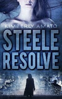
JF: Another strong series design using the same elements as the series just above, all to good effect. Notice that the second cover (below) is weaker because the type has been pressed into use as another image container, and I think it’s pretty clear that this one, unencumbered, is far stronger.
Kim DDD submitted Melting Steele designed by Kitten from DDD. “Cover design for Thriller, Mystery suspense book, The Detective Jasmine Steele Series, book 2”

Kim DDD submitted The Bracelet designed by Milo from DDD. “Cover design for Urban Fantasy Adventure Book”

Kim DDD submitted Twisted Greens designed by Milo from DDD. “Cover design for Mystery Thriller Book”

JF: Not sure what’s going on with the type here, but it’s the weakest element on this cover.
Kim DDD submitted Wonderland designed by Marushka from DDD. “Cover design for Science Fiction, Fairy Tale Retelling, Space Opera book”

JF: Looks like fun.
Kimberly Jayne submitted Demonesse: Avarus designed by Louis Rakovich, Indigo Forest Designs. “I was interested in an atmospheric cover that portrayed the dark, sensual nature and tone of the story, which is urban fantasy (with some spice). I feel like Louis captured that brilliantly. This cover is hard to miss on a page with other great covers.”

JF: It does the job.
Mallory Rock submitted They Tell Me You Are Wicked designed by Mallory Rock.

JF: Strong tone, the man looks a bit small, and I’m not sure what is added to the overall effect the cover is trying to make by the “clever” type arrangement.
Marc Johnson submitted Catalyst (The Passage of Hellsfire, Book 1) designed by Milo from Deranged Doctor Design.

JF: A nicely composed and textured design, although the title maybe could have stood out more against the background.
Mark Stone submitted Calasade: Sanguinem Isle designed by Mark Stone.

JF: Lovely title typography, but the rest of the cover is dark-to-murky-to-illegible, the illustration at the top has perhaps too many figures, and the one at the bottom is indecipherable.
Marta D’Asaro submitted Animali Innamorati designed by Marta D’Asaro.

JF: Pretty, with strong illustration, but the cover is almost completely lacking in impact, and the title seems to be whispering.
Marta D’Asaro submitted Podissea designed by Marta D’Asaro.
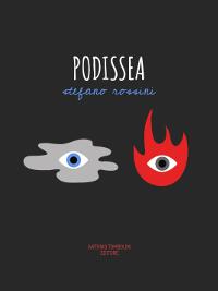
JF: See above. Great illustrations do not automatically make great book covers.
Masha Shubin submitted Alice: Gateway to Evil designed by Masha Shubin. “YA horror story about the exorcism efforts for a demon-possessed teen. The subtitle was deliberately downplayed in the design in order to have the image and title take more center stage for the selling point.”

JF: The knife against those lips is edgy and dramatic, the type seems appropriately rough, but you probably didn’t need the flames on top if it all.
Matt Kelly submitted The Amber Trail designed by Derek Murphy. “Hi there! This story spans both thriller & adventure genres. The initial setting lies in a brewery – hence the beer & hops references on the cover. I was looking to portray a sense of urgency and adventure, and in my eyes Derek did a great job capturing that. Hope you like it! Matt”

JF: Nice composition, notice how it almost forces us to join the fellow on his journey toward the light.
Matthew Jankiewicz submitted Conjure designed by Timothy Tang.
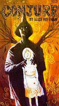
JF: An interesting illustration style, but I’m baffled by the obscure title treatment.
Matthew Stott submitted A Monstrous Place designed by Phil Poole. “I wanted something eye-catching. Something that would evoke childhood horror and spookiness. Something memorable that would grab the eye even when shrunk down to a tiny box on Amazon. I think my designer gave me everything I wanted and more. I love it.”

JF: Love it. Strong, integrated design that gathers all the elements into one unified whole and succeeds in creating the atmosphere and implying the story within. ★
Megan Futcher submitted Fourborn Wind and Fire designed by Andy Futcher. “Thank you for this opportunity! This is one Awesome competition. Hope you like my cover!”

JF: I like it, but tell Andy to go easy on those special effects on the title, the illustration is strong and doesn’t need the extra sprinkles on top.
Michele Orwin submitted Sunset at Rosalie designed by Al Pranke. “The novel is set on a plantation in the early 1900s. The author wanted a road leading up to the plantation house with plenty of Spanish moss.”

JF: The designer has gone all-in with the Spanish moss, but in this case it works. The eye is led to the road stretching into the distance and lands on the careful, classical type at the bottom. Intriguing. What’s at the end of that road?
Mike Reeves-McMillan submitted Auckland Allies designed by Chris Howard. “Chris has captured the key points of both the characters and the setting, following my detailed spec.”

JF: Good concept, but the art seems a bit rough (maybe just the style?) and the title seems a bit overbearing.
P.C. Zick submitted Behind the Bar designed by Travis Miles. “The story takes place in and around the Victory Tavern. The main character is a lover of red wine until broken promises and dreams shatter her chance at love. I worked with the designer to come up with a concept that encompassed the plot of the book. I love the result.”

JF: If it takes place in a tavern, why are we on the beach? I find the whole cover visually confusing although the title is well done.
Patrick Chiles submitted Farside designed by J.T. Lindroos. “This cover incorporates many of the stylistic cues JT used for my first novel, PERIGEE. He did a terrific job of showing the readers they’re in for a much different story within the same world. It provides continuity for a growing series and is a strong brand builder.”

JF: Whether the viewer knows that a book is part of a series, with “continuity of branding” is important, but perhaps not that relevant when evaluating individual covers. This one is a solid sci-fi cover all on its own.
Patsy Trench submitted The Unlikely Adventures of Claudia Faraday designed by Peggy Nuttall & Michael Burge. “The aim was to convey a contemporary novel set in the 1920s featuring the slightly saucy adventures of a ‘respectable’ society lady.”

JF: Graphically and typographically strong, would have liked to see a touch of color to brighten it up.
Paula Cappa submitted GREYLOCK designed by Gina Casey. “GREYLOCK is a supernatural mystery, “quiet horror.” Darkness lurks over the grandeur of Mt. Greylock. Gloomy shadows deepen into grey swells and clefts on the forefront alluding to hunchbacks of whales. Murder, music, buried secrets, beluga whales, and a maddened phantom are the story elements.”
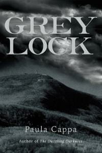
JF: Nice, and I like the tone of this cover that implies the dark tale within.
Phil Gould submitted The Girl in the Mirror designed by Glendon Haddix, Streetlight Graphics. “The cover was designed in collaboration with the author, and includes elements from the books story. Excepting the ‘girl in the mirror’ aspect in the top right half which is self-explanatory, the picture of a father running with his daughter relates to a scene early in the book.”

JF: What mirror? You’re asking a lot of the browser, to take in all these elements and try to make sense of them.
Philip Casey submitted The Water Star designed by Philip Casey. “Cover image by artist Alice Maher, ‘Ankle-deep Woman’ (The History of Tears) 2001.”

JF: Although this cover might work for a collection of poetry, it seems that a literary novel of this quality might have benefitted from something that better reflects its subject matter and the post-war London of its setting.
Phin Hall submitted Montgomery’s Trouble in the Underworld designed by Firedudewraith.

JF: It looks like a strong illustration but the title is very rough and the typography uninspiring.
Phoebe Matthews submitted Lorna Doomed designed by Phoebe Matthews. “Two short silly horror stories for Halloween: Lorna Doomed and The Mushroom Cloud. Lorna Doomed is a zombie story and I was trying to get that effect of the walking dead pressing against the windows that separate them from the living.”

JF: The illustration works but the type needs help.
Rachel Law submitted Once Upon a Fairy Tale: The Enchanted Rose designed by Jami Lai. “This is a juvenile fiction tale for children aged 9-11,an eye-catching & theme related illustration book cover would be fine. The story is at Fairytale College,about a girl & an enchanted rose:Therefore,a school badge with FC,a castle-like school with nice garden, a girl sitting on a sparkling rose.”

JF: Funny, I don’t see the sparkle. The title and brand above it seem to have the wrong relationship. The title could be much larger and the branding should be subordinate to it.
Rachel McClure submitted The Knights of Nevertheless: Escape from the Shadows designed by Dan Thompson. “I was thrilled with Dan’s design for my book!”

JF: The combination of fonts in the title seems pretty odd, and the entire cover comes across as low-contrast and a bit murky.
Rakhi Anand submitted Life of Angela designed by Notion Press. ““Life of Angela” is an adventurous journey to the girl’s dreamland! ”

JF: There are things to like here, but the title looks like it has been squeezed into the space between her head and that dark band at the top. The tangent formed by the “g” grazing her hair is particularly troubling.
Rebecca Chastain submitted A Fistful of Fire designed by Damonza.

JF: Strong fantasy series cover, where the designer gets straight to the point, the confident heroine works her magic, and it’s all underpinned by delicious typography. A real winner. ★
Renee Barratt submitted Out of The Darkness & Into The Light designed by The Cover Counts.

JF: The cover creates a strong atmosphere, and the key is enticing, but the title treatment seems disjointed to me.
Rose Sweetwater submitted Elquin designed by David McGlumphy. “the cover started as a picture from shutterstock that i paid extended rights to. it was edited by David McGlumphy, and the words added by the team at CreateSpace.”

JF: It came together nicely.
RS McCoy submitted Spirits designed by Kit Foster. “Thanks! This looks fun!”

JF: Careful typography and a simple design pay off here, the “ghost” highlight on the right becomes the focal point for the cover, and that’s what was intended.
Sandra Wagner-Wright submitted Rama’s Labyrinth designed by Kate Race of Visual Quill. “Rama’s Labyrinth is biographical historical fiction. The designer utilized a Rama’s photograph with images of Indo-Persian architecture to join person and place.”

JF: Yes, but the final looks a bit flat.
Shawn Kobb submitted Collection designed by James Egan.

JF: Wow. You have to enlarge this to see everything the designer has put in, but even in thumbnail you can see the skull in the background and a man in a hat aiming a pistol straight at you. This high-impact, 50s-style cover is made to look like a worn puply paperback and is perfect for a “hardboiled mystery.” ★
Sheri Fredricks submitted Continuum designed by Dusktil Dawn Designs. “I asked the cover artist for her creative rendition to my adult-level, romantic twist of the children’s fairytale The Princess and the Frog.”

JF: Totally appropriate and a job well done. The dress makes an ideal backdrop for the type, and the location in the distance adds to the romance.
Sherri Hayes submitted Welcome to Serpent’s Kiss designed by Sara Eirew. “This picture was taken as part of a custom photo shoot by Sara Eirew. She also designed the cover.”

Stewart Stafford submitted The Vorbing designed by Rebecca Brown. “I had a clear idea of how I wanted the cover to look with the blood moon on it. We went through many proofs until it looked how I wanted. I crowdsourced opinions on Facebook and that was extremely helpful. People pointed out what they liked and didn’t like and I made the changes until we all agreed”

JF: I guess your method worked, because the cover (and that moon!) communicate lots of atmosphere, and everything fits together nicely.
Susan Hasler submitted Project HALFSHEEP designed by Susan Hasler. “Learning Adobe Illustrator was part of my ongoing effort to stave off dementia. Also, I had such a clear picture of my alien in my mind, I needed to illustrate her myself. I was going for a retro science fiction look. The book is set in the fifties.”

JF: A pro designer would have been useful in helping you achieve the cover you imagined.
Tanya von Ness submitted King of Fools designed by Tanya von Ness.

JF: Impressive typography and subtle dimensionality help this cover stand out. An evanescent “crown” indeed.
Tanya von Ness submitted The Purple Mantis Hotel designed by Tanya von Ness.

JF: You’ve met the cast, you know you’re in for a good ride with this book, and the cover almost dares you to look away. ★
Terence Wallis submitted The Light of the Eldari designed by Yanina Wallis. “The design of the cover focuses mainly on the genre, Sci-fi fantasy. The space aspect is very important to the plot of the book, but the sword is also featured to give readers the idea that the book is more then just a science fiction story, but also a historical fantasy story too.”

JF: Although it’s obvious a lot of work went into this, I have a hard time making sense of this combination of elements.
Todd Adams submitted Winds of Aerathiea designed by T. E. Adams. “Composited in Photoshop from opensource materials and an airship I am currently building in Second Life.”

JF: Groovy. title could be stronger.
Valerie Comer submitted Team Bride designed by Hanna at Book Cover Bakery. “Team Bride is the fourth novella in my Riverbend series. All the covers feature a handholding couple and a handlettered title, as well as the same fluid shape of the header and footer. I’m very pleased with how Team Bride turned out.”

JF: You would think that this type of lettering would get lost against a busy background, but the designer knew better!
Yocla Designs submitted Invasion designed by Clarissa Yeo.

JF: Here the designer has made the story preeminent, to good effect. We’re placed right in the scene confronting an uncertain world. Terrific.
Yocla Designs submitted Salvage Trouble designed by Clarissa Yeo.

JF: Here again the designer relies on elements of story to capture our interest, and adds some nice gloss through the series branding. Looks exciting!
Nonfiction Covers
Abigail Austen submitted Lord Roberts’ Valet designed by Abigail Austen. “I took the cover photo out on patrol with the Afghan army in Panjwai District, Kandahar, Afghanistan. I used the image of a soldier’s back to emphasise the lack of a human face to our efforts there. The Afghan civilians look like something out of Star Wars, which is what Kandahar looked like too.”

JF: It’s a photo that, in the hands of a designer, could make a powerful cover.
Alexander Gerasimchuk submitted The Book of Secret Wisdom: The Prophetic Record of Human Destiny and Evolution designed by Richard Wehrman.

JF: Well designed for its intended audience.
Anca Ioviţă submitted The aging gap between species designed by Anca Ioviţă. “I chose an underwater image for two reasons: 1. life can’t exist without water and this book traces the aging process in many different life forms, so I wanted some unifying element for the book cover 2. most negligible senescence species are marine species e.g. sea sponges”

JF: Serviceable.
Aubrey McGowan submitted Mastering The Art Of Trust designed by Aubrey McGowan.

JF: It’s hard to make sense of this cover since most of it has “bled” onto the white web page background. It looks more like a print book cover than an ebook cover.
Glenn Younger submitted HOW TO MAKE THE MOST OF YOUR EARTH EXPERIENCE (14 Principles for Living Unconditional Love) designed by Letizia Farisato.

JF: Inviting. Although this is a spiritual self-help title, the cover makes it look like a cross between travel and a how-to.
Hugh Smith submitted Seven Days to Kindle: The Overwhelmed Author’s Guide to Formatting an Amazon Kindle Book In an Hour a Day designed by Pro Ebook Covers. “Hi, I wrote this book to help authors struggling with eBook formatting. If you have a full time job a family and the 1,000 other demands that life makes you know how hard it is to get writing done much less learn how to format. I wanted my cover to reflect that.”

JF: I like the idea but the cover looks crowded, distracting and too hard to read.
Kara Lane submitted From Photographer to Gallery Artist designed by OctagonLab. “The image for my book cover was provided to me by award winning photographer, Tenna Merchent. I then submitted the image to OctagonLab, and they designed the cover around the image.”

JF: With a gorgeous image, especially for the photo market, it’s smart to let the image shine, and your design does that well.
Karen Solomon submitted The Price They Pay designed by Mark Oberkrum.

JF: Simple without being simplistic.
Kat Lahr submitted 30 Days Dry designed by Kat Lahr and Susanne Wawra. “The image on the cover was designed to illustrate Mirror-Me, one of the poems inside this collection of poetry – providing a mirror/reflection of how the author felt at the beginning of his 30 Day Journey.”

JF: It has a kind of primitive charm.
Kerry Ellis submitted The Sapphire and the Tooth designed by Kerry Ellis. “The story itself is multifaceted, and I thought one of the title elements would capture that perfectly through a creative flat illustration.”

JF: And the problem, of course, is that to the uninitiated, it tells us nothing about the story.
Lorna Sixsmith submitted How To Be A Perfect Farm Wife designed by Joanne Condon. “Despite perhaps not being brought up on a farm and landed into an alien farming world, farm wives are expected to be efficient multi-taskers, particularly by neighbours and the mother-in-law. The window emphasises the goldfish bowl nature of rural living with her “nearest and dearest” looking in.”

JF: Delightful. An instant classic. ★
Marta D’Asaro submitted Il tuo cuore è una scopa designed by Marta D’Asaro.

JF: Graphically charming but nowhere near strong enough to stand out in the chaotic ebook marketplace.
P. D. Mangan submitted Muscle Up designed by “videoadjust”. “I’m not the designer, I’m the author, but I thought the cover made for me was remarkably good, so here it is.”

JF: Simple but effective.
Pere Ibañez submitted I See Dark designed by Pere Ibañez.

Peter Lusch submitted Solving Problems that Matter and Getting Paid for It designed by Peter Lusch. “Suitable for education, business, and entrepreneur audiences, the use of ‘white board’ illustrations addresses problem solving methodology as metaphor for advising career pathways in social innovation and global sustainable development.”

JF: Clean graphics and a relatable design make this cover stand out. ★
Renee Barratt submitted How To Start A Successful And Profitable Interior Design Business designed by Renee Barratt, The Cover Counts. “There is so much more to Interior Design than colors and fabrics. Hard work, long hours and a bit of technological “magic” also play a huge role. Sara wanted a cover that focused on the working designer, not on a specific style of interior design.”

JF: The beautiful textures and careful arrangement are sure to appeal to her readers.
Russell Phillips submitted Operation Nimrod designed by Kit Foster.

JF: Intelligent composition makes this another strong cover.
Steven DeGregorio submitted The Drama King designed by DeGreg. “Another cover by DeGreg, and another memoir from the same family (oh jeez), and another half face (shut up, already). This one made for Carl’s first print edition, a double-duty cover.”

JF: A talented clan. I like this strong and confident design, it grabs your attention. The “D” in Drama shouldn’t be so close to the man’s ear, the collision is distracting but overall this cover is money. ★
Well, that’s it for this month. I hope you found it interesting, and that you’ll share with other people interested in self-publishing.
Use the share buttons below to Tweet it, Share it on Facebook, Plus-1 it on Google+, Link to it!
Our next awards post will be on December 21, 2015. Deadline for submissions will be November 30, 2015. Don’t miss it! Here are all the links you’ll need:
The original announcement post
E-book Cover Design Awards web page
Click here to submit your e-book cover
Follow @JFBookman on Twitter for news about the E-book Cover Design Awards
Check out past e-Book Cover Design award winners on Pinterest
Subscribe to The Book Designer Blog
Badge design by Derek Murphy
The post e-Book Cover Design Awards, October 2015 appeared first on The Book Designer.
